This is my first blog post. I decided to start because Ben challenged me to write at least once a week.
I made a font and a simple font editor using JavaScript, and while doing it I had some interesting problems to solve. This post is about those.

(This is the font as of today).
Almost a year ago I was fiddling with Figma and decided that it was a good idea to make a font. I have no experience making fonts and I know they are hard to make, but thought that if I started making something simple I could end up with something that would make me happy.
I started with a grid and snapped every vertex to it:

I really liked the "B" because it looks like some cool sunglasses 😎

At this point, I was optimistic about the aesthetic of the font, but iterating on it was starting to become a slow process, and I'm a believer that those who iterate first, iterate twice. The solution: make it with code instead!
I already had a grid and coordinates for most characters, so I expressed the Figma designs as JSON coordinates:
"1": [
[
  [0.5, 1],
  [1.5, 0],
  [1.5, 4]
]
]
Which is perfect for SVG since they translate directly to polylines:
<polyline
  points="2,4 6,0 6,16" // <- I only need to scale them
  stroke-width="2"
  stroke-linejoin="round"
  stroke-linecap="round"
  vector-effect="non-scaling-stroke"
  fill="none"
  stroke="white">
</polyline>
The great thing about polylines and SVG is that I can control the width and the
rounded joins that I wanted. Need some thicker lines? Increase the
stroke-width.
I made the editor with React so I could make changes and preview them faster, and I was ready to try and make this a real font.
Thanks to this tweet by Rasmus Andersson I found out about OpenType.js, a library that can make OpenType fonts directly in the browser.
There was a problem to solve: there is no "polyline" equivalent, so I had to convert my coordinates to proper paths, and that included the rounded corners.
With SVG I can say "draw a line from here to here, with this thickness", let's
call that a "segment", but with OpenType.js I need to define a path by moving
the cursor (moveTo) to the start of the polygon, drawing a line (lineTo) to
each of the vertices, and so on. I had to calculate every vertex, including
points for the rounded corners.
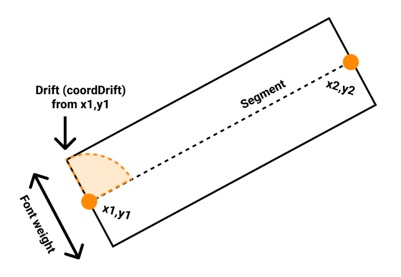
The cleanest way that I was able to solve it was by using polar coordinates. I would calculate the angle of the segment, add 1/4 of a turn to the angle, and move by the weight of the font. That produces the difference between the first point of the segment to the first vertex of the polygon.

/* [x1,y1] and [x2,y2] are
   the start and end of the segment
*/
const polar = cartesian2polar({ x: x2 - x1, y: y2 - y1 });
const coordDrift = polar2cartesian({
  distance: FONT_WEIGHT / 2,
  angle: polar.angle - Math.PI / 2,
});
Since I calculated the new coordinate based on an origin point of 0,0 I can
use coordDrift to draw all four vertices of each segment like this:
glyphPolygon.start(
  (x1 - coordDrift.x)
  (y1 - coordDrift.y)
);
glyphPolygon.line(
  (x1 + coordDrift.x)
  (y1 + coordDrift.y)
);
glyphPolygon.line(
  (x2 + coordDrift.x)
  (y2 + coordDrift.y)
);
glyphPolygon.line(
  (x2 - coordDrift.x)
  (y2 - coordDrift.y)
);
glyphPolygon.close();
glyphPolygon is an abstraction that I made that will buffer each polygon and
will be used to resize and move them all together when necessary.

Progress! This screenshot is from the OpenType.js Glyph Inspector and shows that the approach works.
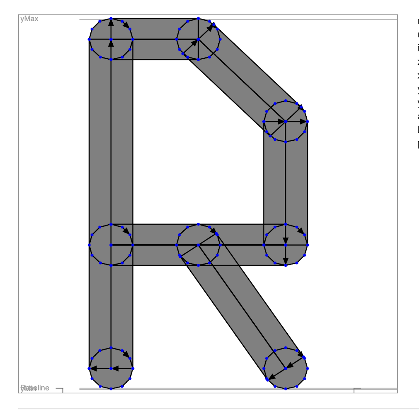
And to make the rounded corners I would do the same! Move the cursor to each vertex, and make a hexadecagon by rotating the polar coordinates 1/16 for each side. To simplify things I will draw a new circle on every vertex.

As you can see, this method produces quite a lot of overlap: segments, rounded corners, and even unused circles inside other segments, but it doesn't matter (yet!), the font was working.
But in reality, it was only working fine on macOS. Windows seems to handle the
overlapping polygons differently (at small font sizes only); it seems like it is
xoring them instead of unioning them.

At least it was clear to me that to fix the issue I had to prevent the overlap. I found this wonderful polygon-clipping library that seems to be exactly what I wanted. And it was!

Oh so clean! Not only that, but the file size of the .otf went down from
40kb to 16kb and the compressed .woff2 from about 7kb to 3kb, pretty
small for a font.
As a nice side effect of removing the overlapping polygons, the font looks much better now at small font sizes.

There is still a lot that can be done with font hinting to improve the quality, but I am happy with the results so far.
The editor itself had its own set of interesting challenges, especially around reflecting the font changes in real-time, but I might write about them later. Try the editor on brutalita.com.